Data Visualization and Analytics
The materials for this project are confidential. Below is a brief summary of the work.
Screenshots of the web app will be posted with permission from the client at a later time.
Background: The Austin FC Academy has a lot of performance data on players and matches, much of it stored in Excel spreadsheets. I reached out to the coaches to gain an understanding of how that data is collected and managed.
Aim: I proposed building a streamlined data pipeline, creating a centralized database, and developing front-end interfaces for real-time data collection during matches and for analyzing and visualizing insights.
Action: Using SQL, I designed and managed the database, and built user-friendly front-end applications with HTML, CSS, and JavaScript.
Result: The new system simplified data management processes, enabling more efficient analysis and the generation of actionable insights through visualizations, ultimately improving decision-making for the club.
Below are some sample analysis outputs. These analyses are fed into the dashboard to be displayed in an interactive, user-friendly manner. Names are changed here for privacy reasons.
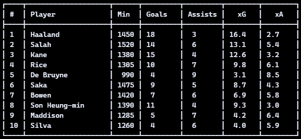
- Sample player leaderboard output:
- Sample player shot map:
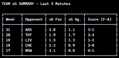
- Sample Expected Goals Summary:
- Sample Scatter Plot showing Expected Goals and Expected Assists over 90 minutes:
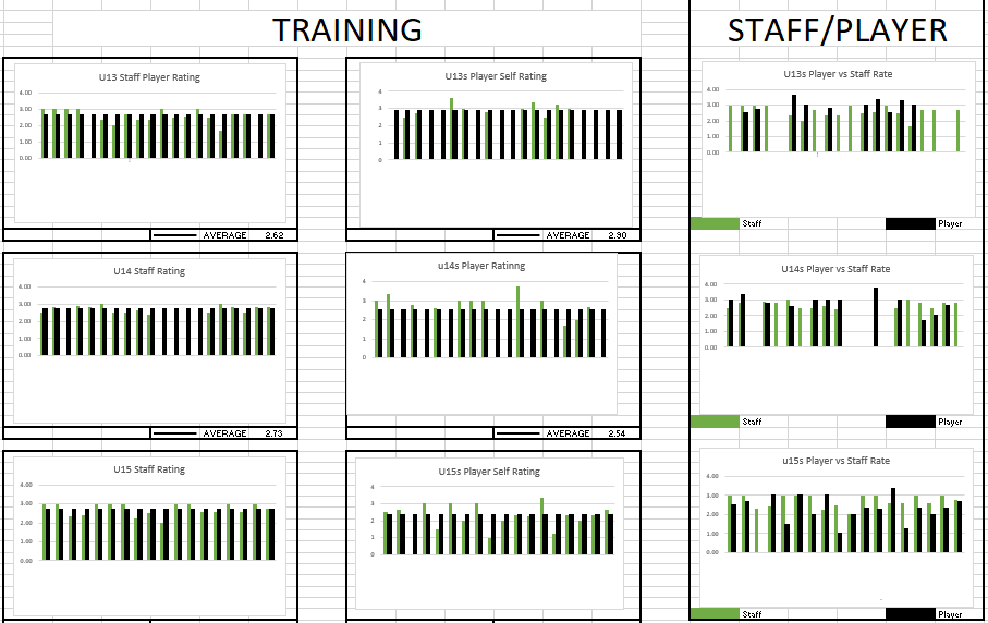
- Player vs Staff Ratings from a Training Session:
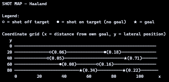
Example points:
- Shot: ★ at (x=88, y=42), xG = 0.71 (close central 1v1)
- Shot: ● at (x=72, y=18), xG = 0.18 (tight angle)
- Shot: ○ at (x=25, y=40), xG = 0.05 (low-probability long shot)
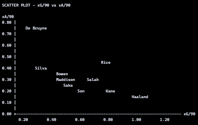 - Top-right: dual threats (high xG/90, high xA/90)
- Bottom-right: pure finishers (high xG/90, low xA/90)
- Top-left: creators (low xG/90, high xA/90)
- Bottom-left: low involvement (both low)